Lego comic panel remake – Strabo’s store
This behind the scenes post is on the recreation of the inside of Strabo’s store. This one was more difficult than the first two recreations, because I feel the original Lego stage I build was not that bad.
Strabo’s Store – the original panel
Figure 1 below shows the original panel from episode five of the first Foolish Lego Comic. However, strickly speaking, the panel I created, is not in the original comic. It shows Darryl peeking into the store whilst Strabo is busy. This would’ve been a panel I would have added before the whole episode – “panel zero” – to give a feeling of the store atmosphere, before Barry and Darryl went in. It probably would’ve been a separate episode. Funny to realise how different everything would’ve been if I rebooted the story… or if I’d given the comic a bit more thought back then 🙂
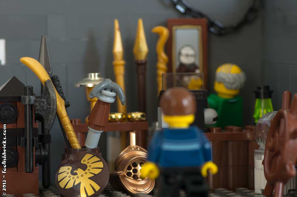
The original image – positives
There are many old objects lying around. I still remember stuffing the scene with all kinds of old-looking Lego items. To me it does feel like a store in antiquities. I also like the perspective of this shot. It’s kind of an over the shoulder shot, the store seen from the viewpoint of Barry. Lastly, I really like the way Strabo is positioned. Casually looking at/ cleaning, straightening the image on the wall. All in all, I’d say, not too bad for the purpose of the comic.
The original image – Room for improvement
This build also suffers from the one thing each and everyone back then suffered from; lack of invested time and building skills. This is really obvious by the look of the wall and the floor. The wall lacks any contrast and some kind of variety in it’s look. It’s also kind of empty (that’s probably the reason for that chain hanging there).
Moving on to the perspective, as I said, I like the viewpoint of Barry in this shot, yet, the use of depth-of-field is confusing. It’s unclear what is important in this panel. Is it Barry or Strabo? The way it is now, only part of the store is in focus; hardly the part the readers should be focusing on. The focus should’ve been on Strabo, especially since the shot has been set up as an over-the-shoulder shot. Furthermore, the atmosphere suffers from the lack of proper lighting, I just did not pay ANY attention to the way the scene was illuminated.
Lastly a nitpick, the location of that gladiator helmet should probably have been more to the front of panel since Darryl will be picking it up when both Barry and Strabo weren’t paying attention.
Strabo’s shop – the recreation
Figure 2 below shows the remake of this panel.
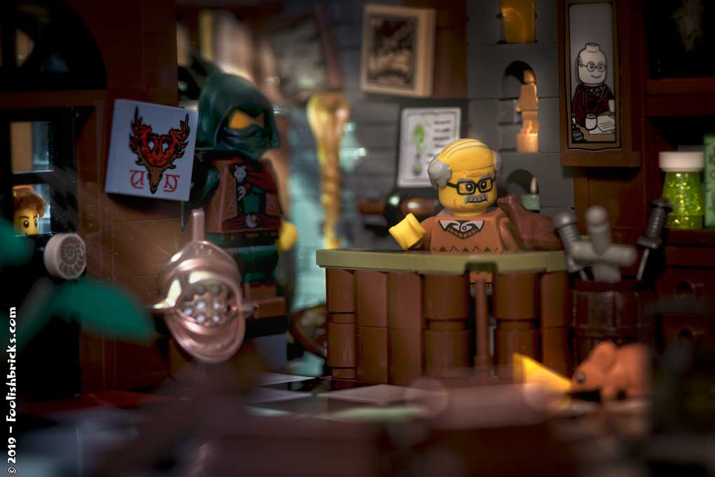
The stage
I still wanted the look of a small, crowded and messy store, where all kinds of objects are lying around. And even if there are less objects within the frame, i believe I pulled off the look. Also, to create some depth, I placed several objects, out of focus, near the lens. Lastly, I thought it would be nice to have the door and some windows in the shot so I could play with light-fall.
Composition
There are a two foci in this image, first Strabo in his little shop (this is the main focus), second Darryl peaking through the window of the door. Using the golden ratio, Strabo is positioned quite right. However, if I use the Fibonacci-spiral, this photo should’ve been cropped at the top and right side. I decided against this; the stage is already more extensive than is shown in the image and I didn’t want to loose more surroundings.
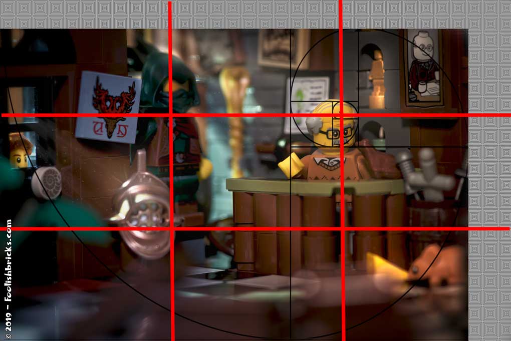
Still, playing around with the Fibonacci spiral shows there is a pretty decent flow in the image going from Darryl, via the mouse to Strabo himself (Figure 3).
Color and mood
Even though the outside of the shop, and also the interior, is a bit darker than it was I felt the lighting should convey a warm feeling. So, there are a lot of yellow-ish colors in the scene. The lights through the window should create a bit of a mysterious atmosphere, but I am not convinced that actually worked.
The little things
I changed Strabo’s green sweater to this one, I simply didn’t like the first one. When I first use Strabo I did not know he would play such a large role in the comic, otherwise I would probably have gone for another print. For this reason, I had to change his position, the back of this torso does not have a print on it.
Furthermore, it’s nice to have all kinds of little easter eggs in an image. For example the light grey sword is a genuine antique sword. This one is from one of the sets I got as a kid; the illustrious “Yellow Castle (375 – 1978)“. Also the helmet has a more notable postion, light and highlight. And it looks as if it already caught Darryl’s attention. Lastly, there is one more giant easter egg concerning the (temporary) faith of Barry and Darryl in the first Foolish Lego Comic. Do you know what I am talking about?
Before and after
Below are the before and after images joined in one image. You can use the slider to show the one or the other.
In conclusion
This time I realised rules aren’t rules, at least not when it comes to photography. Looking at the composition of the final image, I’d much rather use the compositional rules and consciously break them too. As long as the final shot feels good to you and you thought about what you wanted to achieve by breaking conventions.
OTHER POSTS THAT MIGHT INTEREST YOU;
You can subscribe to the newsletter to receive occasional updates from Foolish Bricks.